Service + UX/UI Designer
The Problem
To design a user-friendly booking app. To carry out research and analysis to determine pain points, how apps solve problems for users and to understand the conventions used.
The Solution
To address this problem, I began by studying popular booking apps to identify what aspects resonate with users and where they encounter difficulties. Through usability tests and surveys, I collected user feedback to understand their preferences, expectations, and pain points. Using tools such as affinity diagrams and customer journey maps, I organised the insights from my research. This facilitated a clear understanding of what users appreciated and found frustrating in booking apps, as well as the conventions they would expect to encounter on a website.
The research highlighted that users desired a simple and seamless booking experience. They particularly valued features such as visually appealing images, comprehensive information about the accommodation's location and nearby attractions, details about hotel facilities and surrounding amenities, transparent pricing, and easy-to-find special offers. Additionally, they appreciated functionalities like swift sign-up processes, guest logins, streamlined registration, and the ability to save information for future use.
The Redesign


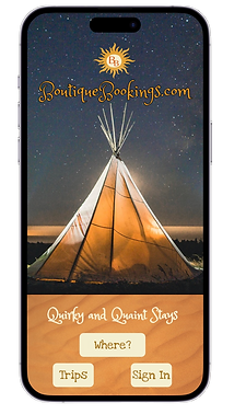
Throughout my journey of advancing my skills in UI design since my student project, I have encountered several shortcomings in the original design. Firstly, the font choices were not tailored for web applications, impacting readability and compatibility. The unconventional font style compromised the design's effectiveness. I have come to appreciate the importance of adhering to recommended font sizes, particularly for mobile devices, following guidelines such as 16 for body text and 38 for main headers.
I have gained insights into the significance of meticulous colour palette selections in elevating the overall aesthetic and user experience. Despite diligent efforts to enhance and refine the design, it remains evident that the app does not meet accessibility requirements. Consequently, a comprehensive rebranding effort is needed to ensure adherence to accessibility standards and foster inclusivity.
These reflections have been instrumental in shaping my approach to UI design, emphasising the prioritisation of accessibility in all future projects.
The Process
To design a user-friendly booking app. To carry out research and analysis to determine pain points, how apps solve problems for users and to understand the conventions used.
Research

Competitive Benchmarking
This revealed that Booking.com excelled in its 'User Rating Comparison', scoring highly with over 80% of its features deemed effective by users. Key features contributing to its success include clear search engines, intuitive date pickers, saved searches functionality, loyalty discounts, and compelling imagery accompanied by detailed descriptions.
Usability Studies
Highlighted successful user experiences and pain points, revealing patterns such as a preference for seamless app navigation. Users sought clear information on hotel locations, nearby attractions, room pricing, and facilities. They valued understanding hotel facilities, special offers, enticing room images, and an easy checkout process. These insights informed my strategies to optimise the user journey for enhanced satisfaction.


Online Surveys
I conducted a concise online survey to explore user experiences with booking apps. While users generally expressed satisfaction with their current app, many also highlighted specific pain points and offered suggestions for improvement.
Analysis
Affinity Diagram
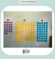
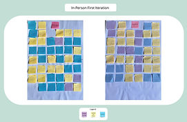
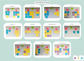
I analysed the research data using an affinity diagram approach, uncovering insights into the world of booking apps. This method enabled me to identify not only the positive features users appreciated but also the pain points they often encounter. I discovered the features users desire or expect, enhancing my understanding of their needs and preferences.


In particular, I found that users gravitate towards booking apps with a seamless and intuitive flow, such as Booking.com. Visual imagery plays a crucial role in setting the holiday mood for users, while maps featuring key landmarks help them visualise their accommodations' locations.
I observed that booking apps tailored to specific audiences tend to resonate more strongly with users, catering to their unique preferences and requirements. These findings informed my approach to designing user-centric booking experiences that prioritise ease of use, visual appeal, and tailored offerings. This gave me the idea of designing a booking app for 'quirky and quaint stays'.


I

Customer Journey Map
I used a customer journey map to analyse user emotions, both positive and negative, as they interacted with a holiday booking app. Amongst the apps examined, Booking.com stood out as the most user-friendly. While users generally expressed satisfaction with the homepage of most holiday booking apps, several issues were identified, including problematic date pickers, insufficient imagery, limited filtering options, and a lack of detail regarding facilities, app location, nearby attractions, and special offers. Additionally, users had mixed sentiments regarding add-ons.
This analysis provided valuable insights into users' mental models and highlighted opportunities for improvement, such as better utilisation of images, enhanced filtering capabilities, inclusion of customer ratings, and clearer presentation of hotel locations.
Design
User Flow
I started the design process by examining the optimal path of the user journey, focusing on the 'happy path'. Using Mira, I crafted a user flow diagram that provided the blueprint for my design. This approach enabled me to deconstruct the booking process into clear and sequential steps, ensuring a seamless and user-friendly experience from start to finish.

Sketching
I sketched out the design screens for the holiday booking app, and planned each step that followed the established user flow. These sketches served as the foundation for translating the user journey into visual representations, ensuring a seamless and intuitive experience for users as they progressed through the app.
High Fidelity Prototype
This prototype represents the culmination of my design process, where I transformed conceptual ideas and sketches into a tangible, interactive experience. The prototype not only demonstrates the visual aesthetics of the design but also provides a functional representation of the user flow and interactions, allowing stakeholders to experience the app's functionality firsthand and allows users to test and feedback.

Design Decisions and Usability Testing
Users expressed a preference for apps offering collections of similar types of accommodation. In response, I conceived an aggregator app specifically curated to showcase high-quality, quirky, and quaint stays. While popular aggregate booking apps may offer such accommodations, users often find it time-consuming to sift through numerous options to find their ideal stay.
The advantage of a tailored aggregator site, with a specific focus, is the ability to streamline the search process, providing users with a smoother and more efficient way to discover their perfect accommodation for that particular trip.
As users were frustrated with complicated booking procedures, the users were given only clear and concise options. After usability testing, the buttons were obvious to users, but the wording of instructions, 'Where' and 'Trips' needed alteration as it caused confusion to some users. (See redesign above).


To enhance user engagement and encourage bookings, it was crucial for the app to prioritise visual appeal and avoid cluttering the interface with excessive information. Users were particularly drawn to visually enticing layouts that showcased ample images of accommodations. Therefore, I ensured that the app's design focused on presenting as many images as possible in a clean and organised manner, allowing users to easily browse and visualise their potential stays without feeling overwhelmed by unnecessary details.
Calendars proved to be a common pain point for users, highlighting the importance of making them easy to understand and use. Following usability testing, positive feedback was received regarding the implementation of easy date selection. Users suggested the inclusion of quick options for adding 1 or 2 night stays, further enhancing the user experience and streamlining the booking process.
Users expressed a strong desire for filters to refine their selections and preferred using interactive maps to locate accommodations and landmarks. In response to users' desire for transparency and informed decision-making, I incorporated an aggregated review score and star rating alongside each hotel image; ensuring that users have access to relevant feedback and ratings during their browsing experience.
Users frequently expressed a preference for browsing before committing to sign up with the company, with some opting to check out as a guest. In addition, add-ons and special offers were well-received by certain users, but it was important to approach these features with sensitivity, with the option to skip add-ons, to avoid overwhelming users.

Reflections and Limitations
The design illustrates a single flow of app usage, with imagery constrained by the use of free images sourced from Unsplash. Usability studies indicated that the app performed well, with potential for further enhancement through the addition of special offers and add-ons. However, careful planning will be necessary to ensure that these features are user-friendly and not overly complex.
Users responded positively to the holiday booking app's concept and were particularly pleased with the unique accommodations offered. In the next iteration, I plan to address the accessibility of the graphics used and reconsider my colour palette choices. While my project initially focused on UX Design and I achieved a mark of 82%, the importance of imagery became evident through research, highlighting the interconnectedness of UX and UI design. Reflecting on this, I recognise the need for additional training in UI Design and I am currently studying for a Professional Certificate in UI through the UX Design Institute to deepen my expertise in this area.


